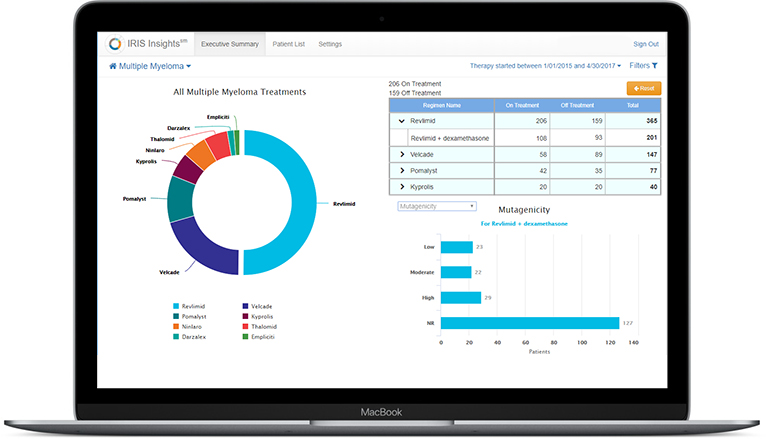
This functional prototype aggregates multiple myeloma drug and patient data into a series of interactive charts, tables, and key performance indicators (KPIs). It was created to sell to drug manufacturers by showing them the efficacy of their drugs and that of their competitors. The dashboard also demonstrated the value of BioPlus services, including cost savings to patients and average times to ship.

Coolest app features
Clicking on any number of the UI screen elements and watching corresponding charts animate, KPIs change values, and tabular data rows show and hide. In other words, data on the entire page adjusted with every click and drill-down.
Biggest accomplishments
- Built within a 10-day deadline and under intense pressure from upper management
- Demoed by senior executives during the 2017 Asembia Specialty Pharmacy Summit to numerous drug manufacturers, specialty pharmacies, and pharmacy benefit managers
- Remained in constant communication with our COO during conference, making last minute adjustments or troubleshooting when called upon
Technologies used
- HTML5/CSS2/3
- JQuery
- Bootstrap
- Highcharts